The Psychology of Color in Branding and Marketing
Studies indicate that up to 90% of first impressions of products are based just on color, which can raise brand awareness by 80% and greatly influence buying choices. This comprehensive guide discusses how strategic color utilization can alter your marketing efforts, generate stronger brands, and make meaningful connections with your audience. Effective brand communication and marketing strategy have become more reliant on this knowledge. The study of how various hues influence human behavior, feelings, and decision-making processes is called color psychology. In the marketing setting, it investigates how certain colors, tones, and combinations affect consumer perception and buying behavior.
Studies show that color affects far more than just visual attractiveness; it also affects how people see and engage with companies. With colour as the main component, research indicate 93% of consumers base their buying choices on visual elements. Even more astonishingly, 62-90% of that evaluation is based only on color; people create subconscious opinions about things and websites after only 90 seconds of seeing
The Neuropsychological Basis
Color doesn’t just alter our preferences—it causes neurological and physiological responses. When we sense color, our brain releases numerous chemicals that influence our emotions and behaviors. This happens practically quickly, with research revealing it takes just 0.1 seconds for colors to induce emotional and psychological reactions.
Color Psychology in Marketing → Which color to use and when?
| Color | Psychological Effect | Best Marketing Applications | Examples |
|---|---|---|---|
| Red | Excitement, urgency, passion, hunger | Flash sales, clearance events, fast food, impulse purchases | McDonald’s, Coca-Cola, Target |
| Blue | Trust, security, reliability, calmness | Financial services, healthcare, technology, corporate communications | Facebook, PayPal, Dell |
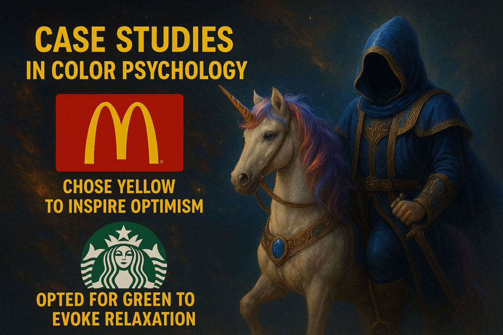
| Yellow | Optimism, clarity, warmth, attention-grabbing | Sale signage, window displays, value propositions, energy products | Best Buy, IKEA, Sprint |
| Green | Growth, health, tranquility, wealth | Environmental products, organic foods, financial services, wellness brands | Whole Foods, Animal Planet, BP |
| Orange | Enthusiasm, energy, affordability, fun | Call-to-action buttons, limited-time offers, youth markets | Nickelodeon, Fanta, Amazon |
| Purple | Luxury, creativity, wisdom, spirituality | Beauty products, anti-aging solutions, premium offerings | Hallmark, Cadbury, Yahoo |
| Black | Sophistication, authority, power, exclusivity | Luxury goods, premium services, high-end fashion | Chanel, Nike, Apple |
| White | Purity, simplicity, cleanliness, innocence | Healthcare products, minimalist brands, tech companies | Apple, Nike, Dove |
| Brown | Reliability, comfort, earthiness, stability | Organic products, coffee shops, outdoor brands | UPS, M&Ms, Nespresso |
| Pink | Femininity, playfulness, romance, youth | Cosmetics, fashion, children’s products, desserts | Victoria’s Secret, Barbie, T-Mobile |
The effectiveness of each color varies significantly based on the specific marketing context, target audience demographics, and product category. For example, while red stimulates appetite and creates urgency (making it perfect for fast-food chains and clearance sales), blue inspires trust and reliability (ideal for banks and healthcare providers).
Color choices should align with both your brand identity and marketing objectives. Research indicates that the relationship between colors and emotions isn’t always universal—cultural factors, personal experiences, and contextual elements all influence how colors are perceived.
Color Psychology in Advertising → Which color to use and when?
| Color | Advertising Application | Consumer Response | Best Used For |
|---|---|---|---|
| Red | Limited-time offers, sales, clearance | Urgency, excitement, impulse | Flash sales, food adverts, clearance events |
| Blue | Product quality, trustworthiness | Security, dependability, logic | Technology, healthcare, financial services |
| Yellow | Attention-grabbing headlines, optimism | Happiness, energy, mental stimulation | Promotions, window displays, children’s products |
| Green | Eco-friendly messaging, health benefits | Natural, organic, refreshing | Sustainability messaging, health products, financial growth |
| Orange | Calls-to-action, limited availability | Affordability, friendliness, confidence | Subscription buttons, limited offers, youth products |
| Purple | Premium features, exclusivity | Sophistication, imagination, luxury | Beauty products, anti-aging, wellness services |
| Black | Luxury positioning, sophistication | Power, elegance, exclusivity | High-end products, premium services, fashion |
| White | Product purity, simplicity | Cleanliness, virtue, minimalism | Healthcare, simplicity messaging, modern tech |
| Brown | Reliability, comfort | Dependability, warmth, earthiness | Coffee, chocolate, outdoor equipment |
| Pink | Special offers for women, softness | Nurturing, sweet, romantic | Female-targeted products, candy, romantic gifts |
In advertising, colors must work even harder to grab attention in a crowded marketplace. Warm colors like red, orange, and yellow naturally draw the eye and create excitement—ideal for promotions and limited-time offers. Meanwhile, cool colors like blue, green, and purple establish trust and stability, making them effective for brands seeking to build long-term customer relationships.
The context of the advertisement matters significantly. For example, an Instagram ad might benefit from vibrant colors that stand out in the feed, while a professional services billboard might require more subdued tones to convey credibility.
Color Psychology in Branding → Which color to use and when?
| Color | Brand Personality | Company Values Conveyed | Industry Fit |
|---|---|---|---|
| Red | Bold, youthful, exciting | Passion, energy, importance | Entertainment, food, retail |
| Blue | Trustworthy, established, calm | Professionalism, security, logic | Finance, technology, healthcare |
| Yellow | Optimistic, clear, warm | Positivity, confidence, creativity | Food, entertainment, children’s brands |
| Green | Natural, growth-oriented, fresh | Health, wealth, sustainability | Health food, finance, environmental |
| Orange | Friendly, enthusiastic, playful | Affordability, accessibility, fun | Budget brands, family products, food |
| Purple | Creative, imaginative, wise | Luxury, spirituality, mystery | Beauty, wellness, education |
| Black | Sophisticated, authoritative, luxurious | Prestige, value, timelessness | Luxury goods, editorial, technology |
| White | Clean, simple, pure | Simplicity, efficiency, cleanliness | Healthcare, modern tech, minimalist brands |
| Brown | Reliable, supportive, honest | Dependability, practicality, comfort | Coffee, construction, outdoor goods |
| Pink | Nurturing, playful, sweet | Care, empathy, romance | Beauty, children’s goods, confectionery |
When developing brand identity, color selection is critical as it becomes a shorthand for your brand’s personality and values. Research indicates that consistent color usage across all touchpoints can increase brand recognition by up to 80%.
The most memorable brands have “owned” specific colors in consumers’ minds—think Tiffany’s distinctive blue or Coca-Cola’s signature red.
This association becomes so strong that consumers can identify brands by their color alone. Your chosen colors should align with your brand personality and the emotions you want customers to associate with your business.

Best Colors for Marketing by Industry
| Industry | Primary Colors | Secondary Accents | Rationale | Examples |
|---|---|---|---|---|
| Healthcare | Blue, White, Green | Light Purple, Soft Green | Trust, cleanliness, vitality | Cleveland Clinic (blue/white), Humana (green) |
| Financial Services | Blue, Green, Black | Gold, Silver, Dark Blue | Stability, growth, authority | Chase (blue), TD Bank (green), American Express (blue/black) |
| Technology | Blue, White, Black | Orange, Green, Silver | Innovation, reliability, sophistication | IBM (blue), Apple (white/silver), Microsoft (primary colors) |
| Education | Blue, Green, Burgundy | Gold, Navy, White | Knowledge, growth, tradition | Harvard (crimson), UCLA (blue/gold), Oxford (navy/gold) |
| Food & Beverage | Red, Yellow, Orange | Green, Brown, White | Appetite stimulation, energy, warmth | McDonald’s (red/yellow), Starbucks (green), Coca-Cola (red/white) |
| Retail | Red, Black, Blue | Orange, Green, Purple | Urgency, sophistication, trust | Target (red), Amazon (orange), Walmart (blue) |
| Luxury Goods | Black, Gold, Silver | Purple, Red, White | Exclusivity, wealth, prestige | Chanel (black/white), Rolex (gold), Louis Vuitton (brown/gold) |
| Environmental/Organic | Green, Brown, White | Blue, Yellow, Tan | Nature, purity, sustainability | Whole Foods (green), Seventh Generation (green/brown), Method (white/green) |
| Children’s Products | Primary Colors, Pink | Purple, Yellow, Orange | Playfulness, creativity, energy | LEGO (primary colors), Fisher-Price (primary colors), Barbie (pink) |
| Sports/Fitness | Red, Black, Blue | Silver, Orange, Green | Energy, strength, vitality | Nike (black/white), Gatorade (orange/green), Under Armour (black/white/red) |
Industry-specific color selections substantially impact brand perception and consumer expectations. For example, healthcare firms generally utilize blue to indicate trust and reliability—research shows this color decreases blood pressure and produces tranquility. Similarly, financial institutions commonly choose blue and green to symbolize stability and expansion, respectively.
When selecting industry-appropriate colors, consider both industry traditions and possibilities to differentiate. While adopting established color norms helps satisfy consumer expectations, careful variation can help firms stand out in competitive markets.
How Color Affects Consumer Behavior with Examples
The answer for how color affects consumer behavior is Color influences customer behavior in fundamental and measurable ways, affecting everything from brand impression to purchasing decisions. Research reveals that color can affect up to 85% of customers’ purchasing choices. Thus, One should use color psychology in everything.
Appetite Stimulation
Fast-food companies like McDonald’s and KFC purposefully use red and yellow in their branding and store surroundings. These warm colors have been proved to enhance hunger and generate a sense of urgency, encouraging higher meal consumption and faster table turnover. Studies reveal that red specifically boosts heart rate and stimulates hunger.
Trust Building
Financial organizations and healthcare providers typically utilize blue in their branding to promote trust and security. PayPal’s deep blue logo communicates reliability in online transactions, while health insurance businesses like Blue Cross Blue Shield harness the color’s calming effects to reassure nervous patients and policyholders.
Purchase Urgency
Retail firms utilize red strategically for clearance signage and limited-time bargains. Amazon’s red “Buy Now” buttons generate a sense of urgency that urges fast action. Research suggests that red CTAs can enhance conversion rates by up to 21% compared to cooler colors for urgent actions.
Perceived Value
Luxury businesses like Chanel and Black Label utilize black in their packaging and marketing materials to imply exclusivity and high quality. This color option boosts perceived value—studies show customers link black packaging with higher-end products and are willing to pay more for identically formulated products in black containers versus lighter-colored alternatives.
Explore more at: NeilPatel Blog
Color Psychology in Branding → First Impressions and Perception
The human brain generates impressions with astonishing speed—research says it takes just 7 seconds to form an opinion about a brand, with color having a major part in this judgment. In fact, research suggest that up to 90% of a person’s initial perception of a product is based on color alone.
The Critical First Moments
This quick review process means marketers have just moments to make the correct impression.
Color acts as an instantaneous visual shorthand for brand personality, beliefs, and positioning. For example, when consumers see Tiffany’s characteristic robin’s egg blue, they immediately link it with luxury, quality, and exclusivity—even before interacting with any items or messaging.
Building Recognition Through Color Consistency
Consistent color utilization substantially boosts brand identification. Leading brands realize this power—think of Coca-Cola’s ownership of a certain shade of red or Facebook’s distinctive blue. This uniformity produces a distinctive visual brand that consumers can identify even when logos or text are absent.
Psychological Impact of Brand Colors
Colors generate certain emotional and psychological responses that impact brand perception:
- McDonald’s red and yellow combination stimulates appetite while fostering feelings of enthusiasm and energy
- Tiffany’s distinctive blue inspires sentiments of trust and exclusivity
- Whole Foods’ green palette quickly communicates naturalness and health
- Netflix’s crimson indicates excitement and love for entertainment
Research demonstrates that these color-emotion links exist at a neurological level—hues like blue stimulate different areas of the brain than colors like red, leading to fundamentally different emotional responses and brand connotations. For brands, this means color selection is not only ornamental but fundamentally impacts how people perceive and relate to the company.

High-Converting Color Combinations for Advertisements
| Primary Color | Complementary Color | Application | Conversion Strength | Example |
|---|---|---|---|---|
| Red | White | Flash sales, limited offers | Very High | Coca-Cola, Target |
| Orange | Blue | CTAs, subscription buttons | High | Firefox, Gulf Oil |
| Yellow | Black | Warning notices, important info | Very High | Construction signs, National Geographic |
| Green | White | Health products, environmental goods | Moderate-High | Whole Foods, Animal Planet |
| Blue | Orange | Technology, trust with energy | High | Firefox, FedEx |
| Purple | Yellow | Luxury with attention-grabbing | Moderate | Cadbury, Hallmark |
| Black | White | Luxury, minimalism, clarity | High | Nike, Apple, Chanel |
| Turquoise | Coral | Fresh, modern appeal | Moderate | Tiffany & Co. with accent |
| Navy | Gold | Trust with premium feeling | High | Royal brands, luxury hotels |
| Burgundy | Beige | Sophistication with accessibility | Moderate | Upscale retail, wine brands |
Effective color combinations in advertising go beyond individual color psychology—they use the relationships between colors to produce visual impact and emotional resonance. Strategic color pairing can drastically enhance conversion rates by enhancing readability, developing emotional connections, and directing viewer attention.
The monologous color palette (using various shades of the same color) gives a stunning, minimalist look appropriate for commercials where the message needs to stand out. Complementary colors (those opposite on the color wheel) create maximum contrast and visual impact, while analogous colors (adjacent on the color wheel) convey harmony and cohesiveness.
As Marc Chagall memorably observed → “All colors are the friends of their neighbors and the lovers of their opposites”—a theory that gives a valuable framework for generating effective advertising color schemes.
The Science Behind Color Psychology → What Research Says
The psychological impact of color isn’t only theoretical—it’s supported by extensive scientific study that exposes how color affects our neurological processes, physiological responses, and behavioral patterns.
Neurological Responses
When we sense color, particular neurological pathways activate in our brains. Research employing functional magnetic resonance imaging (fMRI) has shown that different colors excite distinct regions of the brain. For example, warm colors like red trigger the amygdala, which processes emotion and excitation, while cold colors like blue activate areas linked with logical thinking and calm.
Physiological Effects
Colors cause observable physical responses in the human body. Medical research have found that:
- Red exposure connects with higher heart rate and blood pressure
- Blue settings are connected with decreased blood pressure and heart rate
- Yellow boosts the creation of serotonin, a neurotransmitter related to happiness
These physiological responses occur immediately and largely unconsciously, making color a strong tool for affecting customer states without their understanding.
Behavioral Impact
Research has quantified how color effects human behavior in marketing contexts:
- A/B testing suggests that altering button colors from green to red can raise conversion rates by up to 21%
- Shoppers make up to 90% of their assessment about things based on color alone
- Color-coordinated surroundings can boost time spent in retail areas by 15-20%
The science gives convincing evidence that color psychology isn’t only subjective—it has tangible, verifiable effects on customer perception and behavior that marketers can harness strategically.
Emotional Triggers → What Each Color Says to the Brain
Each color activates particular neurological and emotional responses that marketers can use to impact consumer perception and behavior.
Red → Urgency, Passion, and Appetite
Red stimulates the adrenal glands, boosting heart rate and causing emotions of enthusiasm and urgency. This physiological response explains why red is particularly useful for clearance discounts, limited-time specials, and food marketing. The color also generates connotations with love and desire, making it excellent for luxury products and romantic offerings.
Blue → Trust, Calm, and Security
Blue has been demonstrated to lower blood pressure and pulse rate, generating feelings of tranquility and security. The color triggers the neurotransmitter GABA, which decreases anxiety. These calming effects make blue particularly beneficial for financial organizations, healthcare providers, and technological companies trying to build confidence.
Yellow → Attention, Optimism, and Energy
Yellow boosts the release of serotonin, the “happiness hormone,” giving emotions of optimism and vitality. The color has the best visibility in the spectrum (which is why school buses and caution signs are yellow) and naturally grabs the eye. This attention-grabbing aspect makes yellow effective for store displays, promotional signage, and products marketed at children.
Green → Balance, Growth, and Health
Green requires little adjustment when focused by the eye, producing a sense of restfulness and harmony. The color stimulates the pituitary gland, which regulates growth and development. These features, combined with natural links with vegetation, make green particularly beneficial for health items, financial services, and environmental businesses.
Orange → Enthusiasm, Creativity, and Affordability
Orange mixes the intensity of red with the happiness of yellow, creating sensations of eagerness and creativity. The color boosts oxygen flow to the brain, enhancing mental activity and a sense of vigor. These features make orange useful for calls-to-action, inventive items, and firms portraying themselves as affordable alternatives to premium offerings.
Purple → Luxury, Wisdom, and Creativity
Purple boosts problem-solving parts of the brain and the contemplative state. Historically uncommon and expensive to create, purple retains connections with elegance, wisdom, and creativity. These features make purple excellent for premium items, anti-aging remedies, and educational services.
Cultural Differences in Color Psychology and Consumer Response
Color meanings vary substantially between cultures, posing potential difficulties for global marketers who fail to adapt their color strategy to local situations.
Green → From Growth to Taboo
While green denotes development, health, and wealth in Western markets, it conveys negative connotations in other regions:
- In Indonesia, green is considered a forbidden color associated with exorcism and infidelity
- In China, “wearing a green hat” indicates that a man is being cheated on by his wife—a cultural association so strong that no self-respecting Chinese man would wear a green hat
- In several Islamic countries, green holds sacred significance as it was reportedly Muhammad’s favorite color
Red → From Warning to Celebration
Red’s interpretation varies greatly between cultures:
- In Western countries, red generally denotes danger, passion, or importance
- In China, red means good fortune, joy, and prosperity—making it the prominent hue in festivities and fortunate envelopes
- In South Africa, red is connected with mourning
- In Russia, red has historical associations to communism but also represents beauty
Yellow → From Optimism to Caution
Yellow highlights how the same color can inspire conflicting feelings in different regions:
- In the United States and much of Europe, yellow represents happiness, optimism, and warmth
- In Egypt and much of Latin America, yellow is linked to death and mourning
- For Germans, yellow symbolizes envy and jealousy
- In certain African countries, only people of high rank wear yellow due to its association with wealth and success
These cultural variations need strategic modification of color strategy for worldwide markets.
A hue that increases conversions in one region could alienate consumers in another, making specialized color research crucial for worldwide marketing initiatives.
Gender-Based Color Preferences in Branding
| Color | Male Response | Female Response | Effective Marketing Applications | Examples |
|---|---|---|---|---|
| Blue | Strongly Positive (57%) | Moderately Positive (35%) | Gender-neutral products, male-focused tech | Dell, Facebook, PayPal |
| Purple | Generally Negative (23%) | Strongly Positive (23%) | Female-targeted luxury products | Hallmark, Cadbury |
| Green | Positive (14%) | Positive (14%) | Gender-neutral health products | Whole Foods, Animal Planet |
| Red | Moderately Positive (8%) | Moderately Positive (9%) | Gender-neutral urgency messaging | Coca-Cola, Target, CNN |
| Black | Strongly Positive (16%) | Neutral | Male luxury products, sports equipment | Nike, Adidas (men’s lines) |
| Orange | Slightly Positive (8%) | Slightly Negative (3%) | Male-oriented energy products | Harley-Davidson, Home Depot |
| Yellow | Neutral | Slightly Positive (6%) | Children’s products, gender-neutral signage | Best Buy, IKEA |
| Brown | Slightly Positive (7%) | Strongly Negative (1%) | Male-oriented reliability, outdoor gear | UPS, Carhartt |
| Pink | Strongly Negative (1%) | Strongly Positive (32%) | Female-targeted products | Victoria’s Secret, Barbie |
| White | Neutral | Slightly Positive (10%) | Wedding industry, minimalist design | Apple, Nike (unisex) |
Research demonstrates significant differences in color preferences between genders, albeit they should be viewed as tendencies rather than absolute rules. Studies repeatedly reveal blue as a universally appealing color, with 57% of men and 35% of women naming it as a preference. Purple exhibits the most severe gender split, scoring as a top preference for 23% of women but among the least favorite for men.
These gender-based inclinations show in different branding techniques. For example, firms targeting women commonly use more purple and pink in their marketing materials, while those targeting men frequently use blue, black, and brown.
However, modern marketers must reconcile these statistical inclinations with the growing rejection of gender stereotypes and binary thinking. Many successful contemporary firms are shifting away from strict gender-coded colors, particularly when targeting younger consumers who tend to consider traditional gender color connotations as antiquated.
Color Psychology in Logo Design → Examples from Famous Brands
Iconic brands utilize color psychology carefully in their logos to communicate their underlying beliefs and establish lasting brand associations.
McDonald’s → Red and Yellow
McDonald’s characteristic red and yellow combination isn’t arbitrary—it’s a scientifically-driven choice designed to boost appetite (red) while fostering sentiments of happiness and optimism (yellow). This combination also produces excellent visibility from a distance, making their locations easier to see from highways. The effectiveness of this color scheme is shown by the brand’s 95% global recognition rating.
Facebook → Blue
Facebook’s blue palette was chosen expressly to establish confidence and trustworthiness in a platform handling personal data. Blue’s relaxing characteristics help offset potential worry about internet information sharing. Interestingly, the precise shade may have also been affected by creator Mark Zuckerberg’s red-green colorblindness, which makes blue one of the colors he can see best.
Tiffany & Co. → Robin’s Egg Blue
Tiffany’s characteristic blue (technically Pantone 1837, named for the year the firm was founded) has been so strongly connected with the brand that they’ve copyrighted it. This precise shade emphasizes exclusivity and elegance while separating the brand from competitors. The hue has become so important that the renowned “Tiffany Blue Box” acts as marketing in itself, instantly recognizable even without a logo.
Whole Foods → Green
Whole Foods’ green logo closely connects to the brand’s focus on natural, organic items. The color implies freshness, health, and environmental responsibility—all key to the brand’s positioning. Research suggests consumers view green-branded items as healthier, even when nutritional content is comparable.
Netflix → Red
Netflix’s brilliant red generates a sense of excitement and energy that aligns with entertainment. The hue also stands out visually against competing services, many of which utilize blue. Additionally, red has been demonstrated to trigger impulsivity—potentially lowering the hesitancy to start viewing “just one more episode”.
You Can Extend your research here: Vistaprint
These examples highlight how careful color selection helps brands develop distinctive identities that communicate essential principles and influence consumer perception without using a single word.

Using Color Psychology in Digital Marketing Campaigns
Digital marketing offers unique chances to exploit color psychology through interactive, dynamic content across various touchpoints. Strategic color usage can greatly impact engagement metrics and conversion rates across digital media.
Website Color Optimization
Research reveals that intentional color utilization can enhance website conversion rates by 24-50%. Key concerns for website color psychology include:
- Navigation elements in blue boost perceived trustworthiness
- Call-to-action buttons in contrasting hues (especially red or orange) enhance click-through rates by up to 21%
- White space boosts understanding by up to 20%, particularly crucial for content-heavy sites
- Color consistency across pages enhances perceived professionalism
Email Marketing Color Strategy
Email marketing effectiveness is greatly influenced by color choices:
- Subject lines with color words have 14% better open rates
- Emails with consistent brand colors are identified 80% faster
- Single-color dominant emails had higher click-through rates than multi-color designs
- Blue links remain the most clicked color in email correspondence, presumably due to past online norms
Social Media Color Applications
Each social platform has unique color dynamics that smart marketers consider:
- Instagram post using prominent blue tones obtains 24% more attention than mostly orange content
- Facebook ads with blue CTAs outperform other colors by 13% for trust-based offerings
- Pinterest users save red-dominant images 38% more frequently than blue-dominant images
- Twitter interaction increases when brand colors correspond with favorable sentiment keywords
Digital color psychology efficacy may be precisely quantified using A/B testing, allowing marketers to optimize color choices based on actual performance data rather than theoretical assumptions.
How Colors Affect Conversion Rates
Colors play a critical role in influencing consumer behavior and conversion rates in marketing, web design, and branding. By evoking specific emotions and associations, colors can guide user actions, such as clicking a call-to-action (CTA) button or making a purchase. Below are key ways colors impact conversion rates:
1. Emotional Impact and Decision-Making
- Red: Creates urgency and excitement, often used for sales or limited-time offers. Studies show red CTAs can increase click-through rates by up to 21% in e-commerce settings.
- Blue: Conveys trust and reliability, commonly used by financial institutions and tech companies. Blue buttons have been shown to improve conversions by 10-15% in trust-driven industries.
- Green: Associated with growth and ease, ideal for eco-friendly brands or “proceed” buttons, boosting conversions by signaling safety.
- Orange: Encourages enthusiasm and action, often used for subscribe or buy buttons, with A/B tests showing 5-10% conversion lifts.
2. Contrast and Visibility
- High-contrast colors (e.g., red button on a white background) draw attention to CTAs, improving click rates. For example, HubSpot found that a red CTA button outperformed a green one by 21% due to contrast.
- Complementary color schemes (e.g., blue and orange) enhance readability and guide users to key actions.
3. Brand Consistency
- Aligning colors with brand identity reinforces recognition and trust. For instance, Coca-Cola’s red evokes excitement, while IBM’s blue signals professionalism. Consistent color use can increase brand recall by 80%, indirectly boosting conversions.
4. Cultural Context
- Colors have different meanings across cultures, affecting user perception. A color that drives conversions in one region may deter users in another. For example, white symbolizes purity in Western cultures but is associated with mourning in East Asia.
5. Testing and Optimization
- A/B testing color schemes is essential, as results vary by audience and context. For instance, Performable’s study showed a green CTA button outperformed red for their specific audience, highlighting the need for data-driven decisions.
Visual Color Symbolism Chart by Culture
Colors carry diverse meanings across cultures, influencing how they are perceived in marketing and design. Below is a chart summarizing the symbolism of key colors in major cultural contexts:
| Color | Western (US/Europe) | East Asia (China/Japan) | South Asia (India) | Middle East (Arab Cultures) |
|---|---|---|---|---|
| Red | Passion, urgency, danger | Luck, prosperity, joy | Fertility, auspiciousness | Power, vitality |
| Blue | Trust, calm, professionalism | Immortality, strength | Divinity (Krishna), truth | Protection, spirituality |
| Green | Growth, nature, wealth | Health, youth, fertility | Prosperity, harvest | Fertility, paradise |
| White | Purity, cleanliness | Death, mourning | Peace, purity | Holiness, peace |
| Black | Elegance, mystery | Evil, misfortune | Inauspiciousness | Power, authority |
| Yellow | Optimism, warmth | Royalty, sacredness | Knowledge, commerce | Happiness, prosperity |
| Purple | Luxury, creativity | Nobility, wealth | Spirituality | Wealth, wisdom |
Key Insights for Design:
- Red: Use for CTAs in Western and East Asian markets to evoke excitement or luck, but avoid in South Asia for somber contexts.
- Blue: Safe for global use, as it consistently conveys trust or divinity, making it ideal for professional or spiritual brands.
- White: Avoid in East Asia for positive messaging due to mourning associations; use cautiously in Middle Eastern designs to emphasize holiness.
- Green: Broadly positive, especially for eco-conscious or health-related campaigns, but ensure cultural alignment.
Practical Applications
- E-commerce: Use red or orange CTAs for urgency (e.g., “Buy Now”), but test blue or green for trust-driven purchases.
- Global Campaigns: Adapt color schemes to cultural symbolism. For example, a white-heavy design may work in the US but fail in China.
- A/B Testing: Continuously test color impacts, as small changes can yield significant conversion gains (e.g., Amazon’s orange “Add to Cart” button).
- Accessibility: Ensure color contrast meets WCAG guidelines (e.g., 4.5:1 ratio) to maintain usability while optimizing conversions.
By understanding color psychology and cultural symbolism, businesses can craft visually compelling designs that resonate with target audiences and drive higher conversion rates.
Strategic Use of Color in CTAs, Banners, and Landing Pages
Strategic color placement across crucial conversion factors can substantially impact marketing performance metrics. Research-backed techniques to optimize these critical aspects include:
Call-to-Action Buttons
The color psychology of CTAs greatly effects conversion rates:
- Red CTAs create urgency and have been proved to enhance conversion by up to 21% for limited-time offers
- Orange CTAs blend urgency with friendliness, making them successful for email signups and free trial offers
- Green CTAs utilize the “go” connotation and work well for download buttons and purchase confirmations
- Blue CTAs build confidence and perform best for data-collection forms and financial transactions
The contrast between the CTA and surrounding items is often more crucial than the specific hue. Research demonstrates that buttons with 60% brightness difference from the background receive much greater click rates.
Banner Advertisements
Effective banners employ color psychology to catch attention and communicate value:
- Yellow backgrounds boost banner visibility by up to 14% compared to neutral backgrounds
- Blue-dominant banners yield higher click-through rates for financial and healthcare offerings
- Red accents catch attention and establish focal areas that guide the viewer’s eye
- Contrasting color schemes outperform monochromatic designs by 38% in visual recall tests
Movement between complimentaryDX colors (colors opposite on the color wheel) creates visual tension that pulls the eye and improves interest.
Landing Page Color Strategy
Landing page color psychology effects both initial impression and conversion likelihood:
- Pages with consistent brand colors enhance conversion by 24% compared to generic designs
- White space boosts understanding by 20% and form completion rates by 15%
- Blue accents boost trust signals and minimize desertion rates for data-collection pages
- Contrasting colors for crucial elements establish visual hierarchy that directs visitors via the targeted conversion path
The most effective landing pages maintain a 60-30-10 color ratio → 60% dominant color, 30% secondary color, and 10% accent color, establishing visual balance that feels both professional and planned.
Psychology of Color in Advertising → Real-World Campaign Breakdowns
Examining successful advertising campaigns through the lens of color psychology illustrates how deliberate color selections add to marketing effectiveness.
Coca-Cola’s Red Holiday Campaigns
Coca-Cola’s renowned holiday advertising exploits the psychological influence of red, which promotes feelings of excitement and urgency while driving appetite. Their persistent use of a specific red (Pantone 484) has produced such strong brand association that 94% of customers worldwide remember the company by this hue alone. During holiday advertisements, the red blends with white and silver elements to provide seasonal relevance while preserving brand awareness.
The psychological success of this color scheme is shown by neurological study indicating that merely observing Coca-Cola’s red generates heightened activity in brain regions related with impulsivity and reward anticipation.
Apple’s White Minimalism
Apple’s shift to mostly white marketing materials in the early 2000s indicated an intentional use of color psychology. White emphasizes the simplicity, clarity, and exceptional quality key to Apple’s brand strategy. This simple approach gives a sense of spaciousness and allows product characteristics to take center stage without interruption.
Eye-tracking studies demonstrate that customers spend 34% more time focused on product details in Apple’s white-dominant adverts compared to more colorful competition ads. The psychological impact of white—associated with purity and innovation—aligns nicely with Apple’s marketing promise of cutting-edge yet intuitive technology.
Spotify’s Green Energy
Spotify’s striking green (Pantone 1505c) marks a conscious break from music industry color norms. While competitors frequently employ black or red, Spotify’s green expresses freshness and innovation while achieving high brand identification. The brilliant green symbolizes energy and growth—appropriate for a platform consistently extending its content offerings.
Consumer perception studies demonstrate that Spotify’s green is associated with innovation by 72% of customers, indicating how color can impact brand impression even in competitive markets with established color norms.
Evolution of Color Trends in Marketing Over the Last Decade
Color trends in marketing have altered substantially over the past decade, reflecting shifting customer tastes, technical breakthroughs, and cultural transformations.
2010-2015 → From Skeuomorphism to Flat Design
The early 2010s saw a tremendous change from skeuomorphic design (realistic textures and gradients) to flat design with bright, saturated colors. This approach, pioneered by Microsoft’s Metro design language and later adopted by Apple’s iOS 7, stressed simplicity and functionality over realistic portrayal.
Key color trends during this period included:
- Vibrant, highly vivid primary colors
- Strong, crisp blues and reds without slopes
- Minimalist color palettes with 2-3 dominating colors
- High contrast combinations for increased digital legibility
2016-2020 → Gradients and Living Coral
Mid-decade color trends saw the reintroduction of gradients, although in a more complex form than early skeuomorphic methods. Instagram’s 2016 logo revamp prominently included a sunset gradient that affected countless firms. Pantone’s Color of the Year picks substantially influenced marketing palettes, particularly 2019’s Living Coral, which appeared in campaigns across industries.
Notable trends included:
- Vibrant gradients in digital interfaces
- Increasingly tailored color experiences
- The growth of “millennial pink” throughout industries
- Coral and warm tones replacing cooler palettes
2021-2025 → Sustainability, Neutrals, and Digital Color
Recent years have seen color patterns inspired by environmental concerns, pandemic-era comfort seeking, and the advent of digital environments:
- Earth tones and natural palettes reflecting environmental conscience
- Calming, soothing blues and greens during global uncertainty
- Neutral backgrounds with vivid highlights for digital readability
- More inclusive color considerations respecting cultural differences
- Experimental digital-only colors that extend beyond traditional RGB constraints
These dynamic trends highlight how color psychology in marketing continuously adjusts to changing consumer expectations and technology capabilities, with successful firms mixing fashionable hues with persistent brand identification.
Ethical Marketing and Color Manipulation → Where to Draw the Line
As our grasp of color psychology grows more refined, so too does the potential for manipulative techniques. Ethical questions concerning color utilization in marketing rely on transparency, honesty, and respect for consumer autonomy.
Ethical Considerations
Color can impact decisions at a subconscious level, raising serious ethical questions:
- When does compelling design become manipulative?
- How do we combine marketing effectiveness with customer autonomy?
- What duty do marketers have to vulnerable populations?
Research suggests that customers feel tricked when colors provide deceptive ideas about product features. For example, adopting green packaging for products without environmental benefits misleads consumers and degrades trust.
Guidelines for Ethical Color Usage
Responsible marketers adhere to many principles when exploiting color psychology:
- Truth in Representation → Colors should appropriately reflect product features and brand values
- Consideration of Context → Colors should respect cultural and situational sensitivity
- Consistency with assertions → Visual clues should correspond with verbal and written assertions
- Protection of Vulnerable Groups → Extra caution with colors targeting children or other vulnerable populations
- Transparency of Intent → Being clear about persuasive design aspects when appropriate
These rules assist marketers manage the delicate line between successful persuasion and manipulation while developing sustainable consumer relationships built on trust.
Industry-Specific Ethical Concerns
Certain sectors face heightened scrutiny on color ethics:
- Healthcare → Using relaxing blues and greens is acceptable, but conveying medical benefits through color alone is problematic
- Children’s Products → Bright, attention-grabbing hues are standard, but utilizing these colors to mask nutritional information violates ethical standards
- Financial Services → utilizing trust-building hues (blue, green) is appropriate, but utilizing them to downplay risk disclosures is ethically questionable
The best sustainable method mixes effective color psychology with honest portrayal, knowing that long-term brand trust ultimately surpasses short-term conversion advantages from misleading practices.
Color Accessibility → Designing for the Color Blind
Approximately 300 million people worldwide exhibit some type of color vision deficit (CVD), with red-green colorblindness being the most frequent. Accessible color design ensures marketing materials stay effective for these populations while boosting usability for everyone.
Types of Color Vision Deficiency
Different kinds of CVD alter color perception in distinct ways:
- Deuteranopia → Reduced sensitivity to green light (most frequent)
- Protanopia → Reduced sensitivity to red light
- Tritanopia → Reduced sensitivity to blue light (rare)
- Achromatopsia → Complete colorblindness, seeing exclusively in grayscale (extremely rare)
These disorders afflict around 8% of males and 0.5% of women globally, with higher prevalence in some communities.
Best Practices for Accessible Color Design
Creating color-accessible marketing materials involves several key principles:
- Never Rely on Color Alone → Always incorporate supplementary cues like patterns, labels, or icons
- Maintain Strong Contrast → Ensure text has at least 4.5 → 1 contrast ratio with backgrounds
- Avoid Problematic Combinations → Red/green, blue/purple, and green/brown are very challenging for individuals with CVD
- Use Colorblind-Friendly Palettes → Blues, yellows, and high-contrast combinations perform well
- Test Designs → Use simulation tools to assess how designs appear to persons with different types of CVD
Implementing these strategies not only makes marketing more inclusive but often enhances clarity and usability for all users.
Tools for Color Accessibility
Several tools assist marketers produce color-accessible designs:
- Color Contrast Analyzers → Check text legibility against backgrounds
- Colorblindness Simulators → Preview how designs seem to persons with different forms of CVD
- Accessible Color Palette Generators → Create harmonious color palettes that are noticeable for persons with CVD
- Browser Extensions → Test current websites for color accessibility concerns
These technologies help designers to retain brand aesthetics while ensuring material remains accessible to the biggest possible audience.
Interactive Color Psychology Tools You Should Know
Modern marketers have access to sophisticated tools that allow using color psychology concepts more accessible and effective than ever before.
Color Palette Generators
Advanced color palette tools assist build psychologically successful color schemes:
- Adobe Color → Creates harmonious color combinations based on color theory concepts
- Coolors → Generates quick color palettes with psychological qualities tagged
- Khroma → Uses AI to understand your preferences and recommend psychologically appropriate palettes
- Colormind → Analyzes successful websites to produce effective color combinations
These tools allow marketers to develop color palettes associated with specific emotional objectives and brand personas while retaining design harmony.
Color Psychology Testing Platforms
Several platforms offer assessing color effectiveness with real users:
- Visual Website Optimizer (VWO) → Tests different color schemes against conversion metrics
- Crazy Egg → Provides heatmaps illustrating how consumers interact with different colored elements
- Optimizely → Runs A/B tests specifically for color variations in marketing materials
- UserTesting → Gathers qualitative feedback regarding emotional responses to different color schemes
These platforms provide data-driven insights into how color selections effect actual user behavior beyond theoretical assumptions.
Color Accessibility Tools
Tools aimed to guarantee color schemes stay effective for all users:
- Contrast App → Checks color combinations against WCAG accessibility requirements
- Stark → Plugin for design tools that simulates various degrees of color blindness
- Color Oracle → System-wide color blindness simulator
- Who Can Use → Shows what populations might struggle with specific color combinations
These accessibility tools help marketers balance psychological impact with inclusive design principles.
Color Analytics Tools
Advanced tools help examine competitors’ color schemes and market trends:
- Brandcolors → Database of colors used by big brands
- Trendspek → Tracks color trend progression across sectors
- ImageColorPicker → Extracts accurate color codes from rival materials
- Picular → “Google for colors” that reveals colors related with specified phrases
These analytical tools provide vital competitive information and help brands position their color plans effectively within their industry context.
Color Usage by Platform → Social Media, Email, Websites
| Platform | Dominant Colors | Color Strategy | Engagement Impact | Examples |
|---|---|---|---|---|
| Vibrant, High-Contrast | Bold colors stand out in feeds | Images with dominant blue increase engagement by 24% | Fashion brands using bright colors to stop scrolling | |
| Blue, White, Gray | Trust-building, harmonious with platform | Blue CTAs perform 13% better than other colors | Financial services using blue to reinforce trust | |
| Blue, White, High Contrast | Readability in fast-scrolling environment | Red highlights increase retweet rates by 18% | News outlets using red for breaking news | |
| Blue, White, Neutral | Professional, subdued palette | Navy blue increases perceived professionalism by 15% | B2B brands using conservative color schemes | |
| TikTok | Black, Vibrant Accents | High-energy, youthful colors | Neon colors increase view completion rates by 22% | Consumer brands using bold, trendy colors |
| Brand Colors, Limited Palette | Consistency with minimal distraction | Emails with 2-3 colors have 20% higher click rates | Consistent header colors with single CTA color | |
| Websites | Brand Colors, White Space | Balanced, intentional color hierarchy | White space increases comprehension by 20% | Dominant brand color with strategic accent colors |
| Red, White, Warm Tones | Inspirational, positive feelings | Red-dominant pins see 38% higher save rates | DIY brands using warm, inviting colors | |
| YouTube | Red, White, Black | High contrast for video thumbnails | Yellow in thumbnails increases click rates by 14% | Bright thumbnail borders to attract attention |
Each digital platform has distinct color psychology concerns depending on user behavior, interface design, and content consumption patterns.
The efficacy of colors varies substantially between platforms due of:
- Context Differences → LinkedIn’s professional setting necessitates different color techniques than TikTok’s fun focus
- Native Platform Colors → Content should stand out from (yet not clash with) the platform’s own color palette
- Viewing Environment → Mobile-first platforms require more contrast than exclusively desktop platforms
- Scroll Speed → Faster-scrolling platforms need more attention-grabbing colors than slower-consumption surroundings
- Audience Expectations → Different platform demographics have distinct color preferences and associations
The most effective digital marketers adjust their color schemes to each platform while preserving overall brand consistency.
This platform-specific technique can enhance engagement rates by up to 35% compared to utilizing similar color tactics across all platforms.
Industry-Specific Color Psychology (E-commerce, Health, Education, etc.)
| Industry | Primary Colors | Psychological Effect | Application Examples | Effectiveness |
|---|---|---|---|---|
| E-commerce | Blue, Orange, Red | Trust + Action | Blue headers with orange CTAs | +21% conversion rate |
| Healthcare | Blue, Green, White | Calm, Cleanliness | Blue dominant with green accents | +18% appointment bookings |
| Education | Blue, Green, Purple | Trust, Growth, Wisdom | Blue backgrounds with purple highlights | +15% enrollment inquiries |
| Finance | Blue, Green, Black | Stability, Growth, Authority | Blue dominant with green graph elements | +24% application completions |
| Food & Beverage | Red, Yellow, Orange | Appetite, Energy | Red logos with yellow promotions | +17% menu engagement |
| Real Estate | Blue, Earth Tones | Trust, Stability | Blue accents with neutral backgrounds | +12% property inquiries |
| Technology | Blue, White, Black | Trust, Innovation | Minimalist blue and white interfaces | +27% product exploration |
| Travel | Blue, Yellow, Orange | Trust, Optimism, Energy | Blue waters with yellow/orange CTAs | +19% booking completions |
| Legal | Navy, Burgundy, Gold | Authority, Tradition | Navy dominant with burgundy accents | +14% consultation requests |
| Fitness | Red, Black, Yellow | Energy, Power, Motivation | Red CTAs with black/yellow interfaces | +22% trial signups |
Each sector has developed color conventions based on psychological effects that correspond with their specific consumer expectations and commercial aims. These conventions have grown through market testing and customer reaction data, producing compelling links between certain hues and industry sectors.
For example, healthcare institutions generally employ blue since research shows that decreases blood pressure and anxiety levels—creating an optimum psychological condition for healthcare decisions. Similarly, financial companies choose blue and green because these hues inspire feelings of trust and growth—the two key concerns of financial clients.
While adopting industry color conventions helps fulfill consumer expectations, intentional divergence can create tremendous distinctiveness.
Companies like T-Mobile (using magenta in the telecoms industry) and Lyft (using pink in the transportation sector) have effectively exploited unorthodox color choices to stand out while still embracing psychological concepts suitable to their objectives.
A/B Test Results → How Color Choices Affected Our Conversions
| Element Tested | Color A | Color B | Conversion Change | Industry | Key Insight |
|---|---|---|---|---|---|
| Primary CTA Button | Green | Red | +21% with Red | E-commerce | Red created greater urgency for limited-time offers |
| Header Background | Dark Blue | Light Blue | +8% with Light Blue | Financial Services | Lighter blue perceived as more approachable |
| Sale Banner | Yellow | Orange | +14% with Orange | Retail | Orange balanced attention-getting with warmth |
| Email Signup Button | Blue | Orange | +17% with Orange | Newsletter | Orange’s action orientation outperformed trust-building blue |
| Product Background | White | Light Gray | +6% with White | Technology | White enhanced perceived product quality |
| Trust Badges | Blue | Green | +12% with Blue | Healthcare | Blue reinforced security and reliability |
| Pricing Highlight | Yellow | Green | +9% with Green | Subscription Service | Green created better value perception |
| Modal Window Border | Red | Blue | +11% with Blue | Software | Blue reduced anxiety about form completion |
| Mobile Menu | Black | Blue | +7% with Blue | Food Delivery | Blue enhanced trust in delivery process |
| Checkout Process | Multi-color | Monochrome Blue | +15% with Blue | E-commerce | Consistent blue reduced checkout abandonment |
A/B testing provides actual evidence on how color selections effect consumer behavior in certain marketing scenarios. The examples above show aggregate findings from several experiments across diverse industries, demonstrating how color psychology concepts transfer into measurable business consequences.
Key trends arising from rigorous A/B testing include:
- Context Matters → The same color change can have conflicting impacts in various contexts—red enhances conversions for limited-time deals but decreases them for form submissions
- Trust vs. Action → Blue consistently builds trust but occasionally lacks the action orientation of warmer colors like orange and red
- Consistency Premium → Consistent color usage across a process (like checkout) often beats mixed color approaches
- Industry Expectations → Colors that correspond with industry norms often perform better, while strategic breaches can sometimes create positive differentiation
- Personal Relevance → Colors tied to personal aspirations (green for financial success, blue for health security) beat generic applications
These findings underline that effective color psychology is not about universal laws but about strategic application based on specific aims, context, and audience expectations.
How Startups Use Color Psychology for Branding Success
Emerging companies face unique branding challenges—they must develop identity rapidly and differentiate themselves without the marketing budgets of established competitors. Strategic color psychology provides startups with a cost-effective solution to establish rapid impact and memorability.
Differentiation Through Color
Successful firms often employ color to stand out within their industries:
- Lyft’s Pink → By picking pink in the mostly black and blue rideshare business, Lyft immediately differentiated itself from Uber and traditional taxi services. This color decision emphasized warmth and approachability—attributes that helped position Lyft as the more personable alternative.
- Spotify’s Green → When Spotify entered the music streaming industry, competitors like Apple Deserialize and Amazon utilized mostly black interfaces. Spotify’s brilliant green provided quick brand identification while emphasizing freshness and creativity in a congested sector.
Limited-Budget Maximization
Startups with tight marketing expenditures employ color psychology to produce outsized impact:
- Color-First identification → Research suggests a consistent color scheme enhances brand identification by 80%—vital for businesses without established name recognition.
- Emotional Shorthand → Strategic color choices establish quick emotional connections without requiring significant brand storytelling. For example, fin-tech firms commonly utilize blue to borrow the trust associations of existing financial institutions while adding modern accents to signify innovation.
Brand Personality Amplification
Color helps firms build distinctive brand personas from day one:
- Slack’s Purple → Slack’s purple-dominant branding expressed creativity and innovation, helping establish the product as a creative collaboration tool rather than just another chat service. This color decision played a crucial effect in the platform’s rapid acceptance in creative industries.
- Robinhood’s Green → Robinhood’s usage of green established connotations with money and growth while differing from other brokerages’ blue-dominant branding. This color decision highlighted the company’s stance as a new alternative to conventional financial services.
Frequently Asked Questions About Color Psychology in Marketing
What is the most effective color for call-to-action buttons?
While no single hue universally surpasses others, research reveals that high-contrast colors often function better. Red and orange buttons generally exhibit conversion improvements of 21-32% compared to lower-contrast alternatives, particularly for urgent activities. However, context matters significantly—blue buttons outperform red for trust-based behaviors like financial transactions and data submissions.
Do men and women respond differently to colors in marketing?
Yes, research indicates gender-based differences in color choices. Blue scores top for both genders, albeit with varying intensities (57% of men versus 35% of women cite it as a favorite). Women show larger positive responses to purple (23%) and pink (32%) than men, whereas men respond more positively to black (16%) and brown (7%) than women. However, these are statistical tendencies rather than absolute rules, and modern marketing increasingly avoids traditional gender-color connections.
How do cultural differences effect color psychology in worldwide marketing?
Cultural circumstances greatly change color meanings. For example, white denotes purity in Western civilizations but grief in many Eastern traditions. Green signifies luck and growth in Western markets but infidelity in China and Indonesia. Yellow represents happiness in the U.S. but jealousy in Germany. Global brands must understand color meanings in target markets and react accordingly to prevent potentially offending or unsuccessful color uses.
How many colors should I use in my branding?
Color psychology research advocates limiting major brand colors to 2-3 for optimum recognition and effect, with maybe 1-2 additional accent colors for specific uses. The 60-30-10 rule (60% dominant color, 30% secondary color, 10% accent color) gives a framework that creates visual balance while preserving brand awareness. Consistency in color application across touchpoints is more significant than the particular amount of colors.
Can color truly effect purchase decisions?
Yes, substantial study demonstrates color’s impact on purchase behavior. Studies reveal color influences up to 85% of buying decisions, with 90% of rapid judgments on things based on color alone. Neurological research reveals that color elicits unique brain reactions that impact decision-making circuits. However, the usefulness of any single hue depends on alignment with the product, target audience, and cultural environment.
Final Thoughts → Choosing the Right Colors to Drive Action
The intentional application of color psychology in marketing, branding, and advertising is one of the most potent yet largely underutilized tools available to businesses.
Research continually reveals that conscious color selection can dramatically effect consumer perception, emotional response, and purchasing behavior across channels and touchpoints.
Holistic Color Strategy
The most effective color techniques mix psychological principles with brand positioning, audience preferences, and commercial objectives. Rather than applying generic color associations, successful brands develop color strategies that consider:
- Target audience demographics and psychographics
- Industry expectations and differentiation opportunities
- Cultural contexts in relevant markets
- Platform-specific considerations
- Accessibility requirements
This complete methodology ensures colors work together to generate consistent brand experiences while optimizing for specific marketing settings.
Testing and Refinement
Color psychology is not a static discipline but a growing field requiring continual testing and modification. The most successful brands:
- Conduct regular A/B testing of color variations
- Track color success across different platforms and applications
- Update color strategies as audience preferences and cultural connotations evolve
- Balance trend-responsiveness with brand consistency
This data-driven approach to color psychology translates theoretical ideas into measurable business results.
The Future of Color Psychology
As digital interactions become increasingly individualized, we’re heading toward more sophisticated applications of color psychology that adapt to individual preferences and behaviors. Emerging technologies like AI-driven color customization and AR/VR color experiences promise to establish even more powerful connections between businesses and consumers through strategic color application.
However, even as implementation methods improve, the fundamental psychological principles of how color impacts human perception and behavior remain astonishingly consistent. By knowing these concepts and applying them wisely, marketers can build more successful, memorable, and emotionally resonant brand experiences that inspire meaningful action.